GD::Graph makes it easy to create various types of graphs using Perl. The distribution comes with an extensive set of examples. In this article we are going to see a bar-graph and how various parameters impact its look.
We'll start with a script with a number of commented out and then one by one we're going to enable each one of the parameters. In the meantime we will keep the data (mostly) the same.
This code is based on the sample11.pl file included included in the distribution.
use strict;
use warnings;

use GD::Graph::bars;
use GD::Graph::Data;

my $data = GD::Graph::Data->new([
    ["1st","2nd","3rd","4th","5th","6th","7th", "8th", "9th"],
    [    1,    2,    5,    6,    3,  1.5,    1,     3,     4],
]) or die GD::Graph::Data->error;


my $graph = GD::Graph::bars->new;

$graph->set(
    x_label         => 'X Label',
    y_label         => 'Y label',
    title           => 'A Simple Bar Chart',

    #y_max_value     => 7,
    #y_tick_number   => 8,
    #y_label_skip    => 3,

    #x_labels_vertical => 1,

    #bar_spacing     => 10,
    #shadow_depth    => 4,
    #shadowclr       => 'dred',

    #transparent     => 0,
) or die $graph->error;

$graph->plot($data) or die $graph->error;

my $file = 'bars.png';
open(my $out, '>', $file) or die "Cannot open '$file' for write: $!";
binmode $out;
print $out $graph->gd->png;
close $out;
After loading the GD::Graph::Data module that represents the
raw data, and the GD::Graph::bars module that handles the creation of the vertical bar-graphs, we create the data.
The first array reference holds the values of the x-axis, the second array reference holds the corresponding values
of the y-axis.
Then we create a GD::Graph::bars object. Set some parameters and call the plot method that
draws the image. At the end we call $graph->gd->png that exports the image in PNG format.
In this example we save the image in a file, but if this was a web environment we might just return the image.
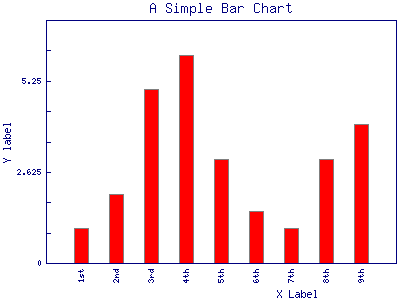
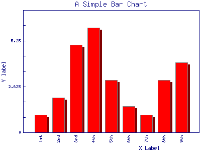
Running the script will generated the following graph:
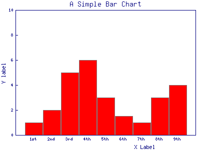
It is a bit "bulky", but we can clearly see the values on the x-axis we provided in the data.
It is clear that the content of the title parameter is at the top of the graph and the values of the
x_label and y_label parameters were added under the x-axis and next to the y-axis respectively.
Let's see what happens as we enable the rest of the parameters one-by-one.
y_max_value
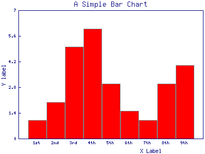
In the previous graph the y-axis ran from 0 to 10. I am not sure why did it run exactly to 10, it is somehow calculated from the max value that needs to be displayed. (In a simple experiment I changed one of the values to 12 and the y-axis ran up to 25.) In any case, if you are not satisfied with the max y-axis value calculated by the module, you can supply your own number using th y_max_value parameter. We set it to 7 and got the following result:
y_max_value => 7,
y_tick_number
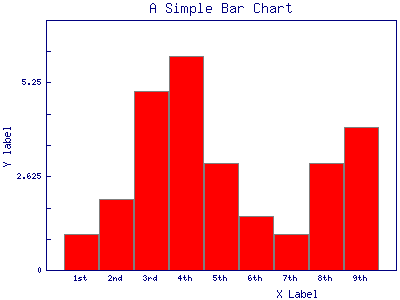
If you look at the y-axis of the previous graphs, you'll see there are 5 numbers above the 0 4 of them with little "ticks" and the 5th is the max-value of the y-axis.
The number of ticks is controlled by the y_tick_number parameter. It defaults to 5, but for the next graph we set it to be 8 and indeed we now have 8 numbers above the 0 including the max value of the y-axis.
These ticks can make it easier to see how tall each one of the bars is.
y_tick_number => 8,

y_label_skip
While having many ticks and corresponding y-values can make it easier to read the graph, but if we have two many of them then the graph might get ugly or the numbers might become unreadable. An alternative that you can see employed in many places is to have many ticks, but show the numbers only at some of them.
The y_label_skip parameter
controls this behavior. Though the name of the parameter is probably incorrect because the value of
this parameter defines which ticks should have a number as well. y_label_skip => 2 means
show the number on every second tick, y_label_skip => 3 means show the number on every 3rd
tick, etc. (It defaults to 1, showing the number on every tick.)
y_label_skip => 3,
x_labels_vertical
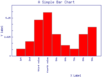
Looking back at the previous graphs, you can see that the values on the x-axis were readable. (Well, if you have good eyes or good glasses.). What if the values are longer than what would fit under a single bar? In that case the values of the x-axis would overlap and we would not be able to read them. In order to demonstrate this, I have changed the data to have longer values for the third and fourth column:
["1st","2nd","third value","fourth value","5th","6th","7th", "8th", "9th"],
and generated the graph again. Here the text of those two columns overlap and is not readable.

That's where the x_labels_vertical is useful. It is a boolean flag and by default is 0 (meaning off). If we set it to some true value (for example 1) then the names will be printed vertically. This means we might need to tilt our head to read them, but at least they don't overlap each other:
x_labels_vertical => 1,
bar_spacing
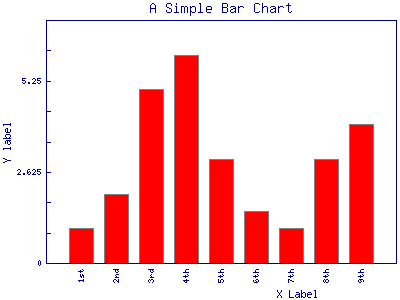
By default the bars touch each other. This makes the graph a bit bulky. The bar_spacing parameter allows us to set the number of pixels between the bars. We set it to 20 that made the bars to be very thin. This is probably too much for this graph.
bar_spacing => 20,
A value of 10 would probably look better:
shadow_depth
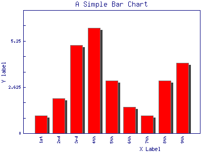
In order for the bars to be more live (more 3D-like) we can add shadow. The shadow can be either on the right side or the left side of the bar. The shadow_depth variable controls how many pixels the shadow will use and in which direction. A positive number will create a shadow to the right, as can be seen in our result:
shadow_depth => 4,
A negative number (-4 in this case) would put the shadow to the left:
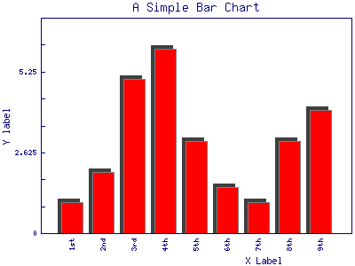
If the shadow_depth is bigger than the bar_spacing this looks awkward.
shadowclr = dred
The shadowclr parameter allows us to set the colour (with the u) of the shadow. The example that came with the module used the colour called dred which I've never heard off, but looks like some deep-red. In any case the values needs to be one of the GD::Graph::colourpredefined colours.
shadowclr => 'dred',

transparent
By default the background of the graph is going to be transparent. On this page the background is white and thus the background of the graphs is also white. We can turn off transparency by setting the boolean parameter transparent to 0.
transparent => 0,
Drawing the graph again won't show any difference though.
What if we show the last two images but set the background of the HTML page to red using the background-color
property of CSS. The left graph is drawn with the default value of transparent (which is 1)
and thus we see through the graph and see the red background of the HTML page.
The right graph is drawn with transparency turned off transparent=0 and so it has the background
of the drawing itself.
Conclusion
There are even more parameters one can set for a GD::Graph and there are plenty more examples.
Comments
thank you very much
How to change the bar coloue?
Thank you this helped me a lot :)
